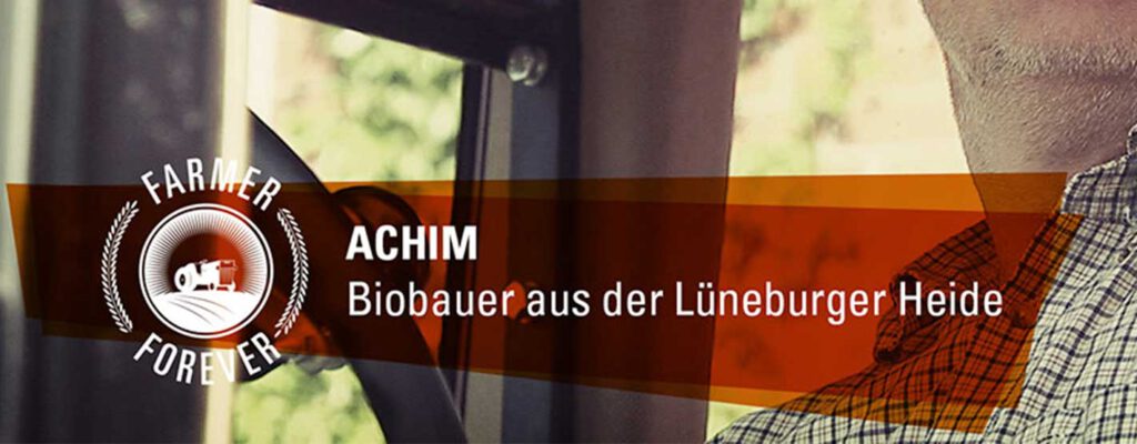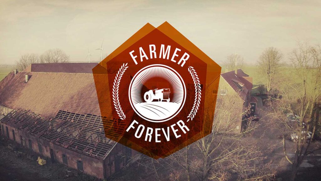

For “Farmer Forever,” we developed a sophisticated design concept that blends tradition with modernity. The logo is striking yet simple, incorporating agricultural elements complemented by modern typography to symbolize the link between down-to-earth roots and a contemporary look. Lower thirds and subtitles are clearly structured and kept in warm earth tones, ensuring readability and a harmonious fit within the overall visual without distracting from the content. The design is rounded off by stylized icons visualizing agricultural activities like tractors, animals, or fields, seamlessly integrating into the series’ modern appearance. The color grading bathes the scenes in natural, earthy tones, creating an inviting atmosphere and underscoring the authenticity of the stories shown. Overall, the design of “Farmer Forever” merges modern aesthetics with grounded themes, bringing viewers straight into the heart of farming.